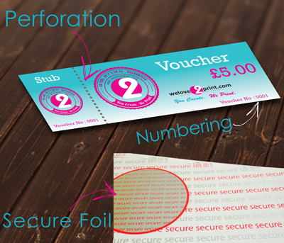
Designing a gift voucher is very important to any business that aims to increase their sales as well as popularity. A well designed gift voucher has the ability to bring in new customers and get the existing customers to come back. Whether a business person wishes to make your own gift voucher for a promotional event or a routine affair, it is crucial to emphasize factors that would attract recipients and the organization’s identity. Here, this blog will lead you on designing the best gift voucher to impress your customers.
Keep It Simple and Clear
Gift voucher design does not need to be complicated. Do not overcrowd the voucher with too much information. While the design is clean and not very complex, all the important aspects can be easily noted. Basic aspects like the voucher’s value, up to date it remains valid, and other conditions must also be provided on the voucher. The voucher must be designed in simple font and structure so that the recipient is able to grasp the voucher’s worth and how to use it.
A plain design looks more professional and, for the recipient, more attractive. It is also important to note that simplicity is the key to gift voucher design.

Reflect Your Brand Identity
Your gift voucher should not depart from the image you have created for your brand. Make sure you are using your brand colors, logo, and fonts, as this will help make the website look professional. This is good since it reminds consumers about the brand and makes the voucher easily recognizable. Brand consistency also helps to establish credibility in the market with your customers.
Perhaps you wish to include a slogan or a brief message summarizing the company. This can make the voucher feel special and unique to the recipient. Incorporating your brand elements makes a nice and unique personalised gift voucher, and the end product that will be presented to the client is professional and appealing.

Use High-Quality Images
If you operate a spa business, ensure that you have calm pictures of your spa services. If you own a restaurant, cook delicious foods and capture them appropriately to entice the customer.
Don’t use images that are common to everyone, as they are not appealing to the eye. However, it is advisable to use business photos that capture the business’s specialty. Good images give your voucher a professional look and encourage the recipients to use it.
Use Call to Action
Some changes are that there is no CTA which should be added to force the recipient to use the voucher. This is why words such as ‘Redeem Today’, ‘Limited Time Offer’, or ‘Treat Yourself’ can cause the customers to act. The CTA must be easily noticeable, so it is recommended to make it in bold fonts or contrasting colors.
An effective CTA should be simple and placed in a strategic location to make the reader feel as though they have to act now. This can go a long way in raising the redemption rate of your gift vouchers. A good CTA has the potential to transform an ordinary voucher into a tool of marketing influence.
Conclusion
The key factors mentioned above in gift voucher design result in gift voucher printing. If you follow the above steps, you will be able to create nice-looking gift vouchers that will advertise your business. Regarding business and premium gift vouchers, WeLove2Print is a recommended printing company for this kind of product.